Guest post from Pamela Wilson
“Color” may feel foreign to you — like a language you don’t speak.
If you’ve never learned how color influences us as humans, you’re right — it’s a language you don’t speak!
Fortunately, anyone can learn the basics of using color. That’s a good thing, because color is super powerful:
Studies have shown that color increases brand recognition by up to 80 percent.
How would you like to increase recognition by 80 percent? I know I would!
It’s not hard — and anyone can do it. No design degree or special “artistic” gene is required, I promise.
Because you’re one of Andrea’s readers, I know you’re interested in creating social media graphics that work.
So today, I’m going to teach you the basics of color so you can use its power to get attention with all your social media graphics.
I’m going to share four tips that will help you choose and use color in your graphics just like a professional designer.
I’ve got a free color tool you can download and start using right away, too — read on!
1. Limit your color palette
It’s easier to to understand and remember simple things.
And it’s easier to remember and associate a color palette with a brand when that color palette is extremely limited.
That’s why we see so many professional designers creating corporate identities based on just one or two colors:

I recommend you use this pro tip:
Use no more than two main colors to represent your brand.
It’s a smart idea to choose and use a third color for an accent — for buttons or links, for example.
Get my free Color Confusion Resolved guide to get some help with this!
My recommendation as a design pro? Tell your brand’s color story with restraint — that will help your social media images get recognized in an instant, and be remembered for weeks and months to come.
2. Think of the environment your social media graphic will “live” in
Social media graphics float around in a sea of existing colors.
On Facebook, it’s blues. Instagram is pretty neutral with just black and grey. Pinterest uses red as an accent.
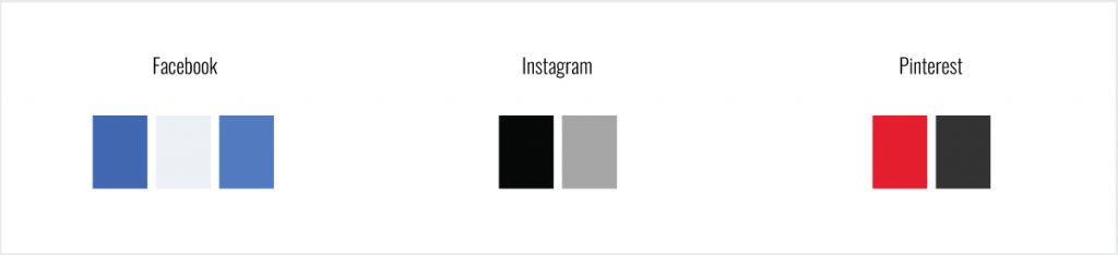
When you’re creating social media graphics for a platform that features lots of color (like Facebook), ask yourself:
Do I want my graphics to stand out or blend in?
If you want your graphics to stand out, use colors that are on the opposite side of the color wheel than the colors already on the platform.
Facebook’s blues are cool. Using warmer colors like reds, oranges, violet, and golden yellows will help your social media graphic to stand out from its environment.
3. Use color to control reading order
Did you know that you can use color to control the order in which your social graphic is read and understood?
Wild stuff, right? Here’s what that looks like.

Notice how your eye goes directly to the pink text in the second image?
And see how you barely notice the light grey photo credit in the second image?
That’s the power of color in action!
The bright color is directing your eyes to go directly to it. And the photo credit almost disappears because it’s light grey and low contrast.
Remember this:
Color can be used to direct attention to parts of your image and away from others.
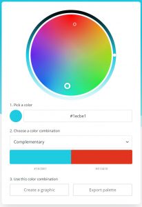
4. Use a color wheel like a boss
The tool at the heart of all these tips is a color wheel. Color wheels show you the relationship between colors. These handy (and beautiful!) graphics give you a map to:
- Color opposites
- Color similarities
- Color tints
- Color shades
… and so much more.
I share two color wheels in my free Color Confusion Resolved guide. One shows colors with white added and the other shows colors with black added.
When you have a color wheel in hand, take a look and notice that:
Colors that sit along the same “ring” in the color wheel look visually related, like these:

Colors that sit within the same “slice” of the color wheel seem visually harmonious, like these:

Colors that sit opposite one another on the color wheel seem to clash in a very high-energy way, like these:

Put these color tips together to create stunning social media graphic

I’d love to show you more about how you can create social media graphics that stand out from the rest — even if you’re not the “artistic” type.
I have a workshop that goes into detail about how to create visual marketing that works.
It’s free and it’s on-demand — so you can watch it whenever you want.
I’d love to see you there!
Register for the Brand Your Business with Stunning Visuals in 30 Minutes or Less! workshop.
Discover how you can combine colors, fonts and photos to create social media graphics that make an impact starting today.
 Pamela Wilson is the founder of BIG Brand System, where she helps people build online businesses they love. Get her free marketing, design, and business-building resources here.
Addendum: Canva has another great Color Wheel tool that you can use.