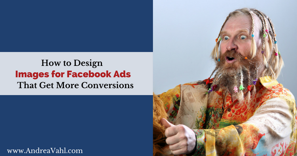
Are you wondering how to design images for Facebook Ads that really work? In this article I’ll dive into how you can create noticeable images that gets more conversions (or clicks, or whatever your goal).
Tip #1 – Start with the right size
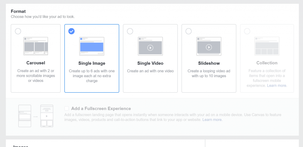
In general the best size for most single image types of Facebook ads is 1200 x 628 pixels or something with proportions 1:1.91. If you have an image that is sized differently, the image will get cut off.
Event ads and Like ads (under the Engagement objective) are sized at 1200 x 444 pixels.
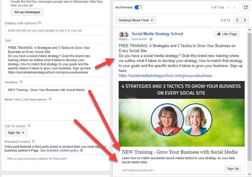
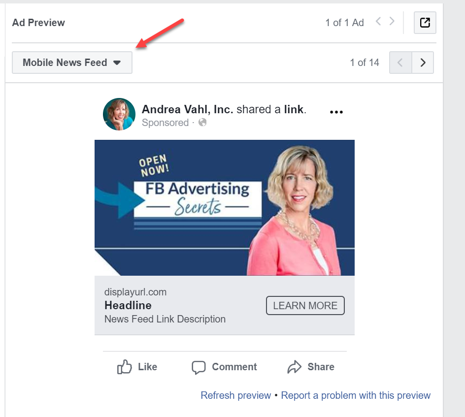
Once you choose the image, make sure you use the other Text areas in your ad.
For Carousel Ads or Instagram Ads, use a square 1080 x 1080 pixel image.
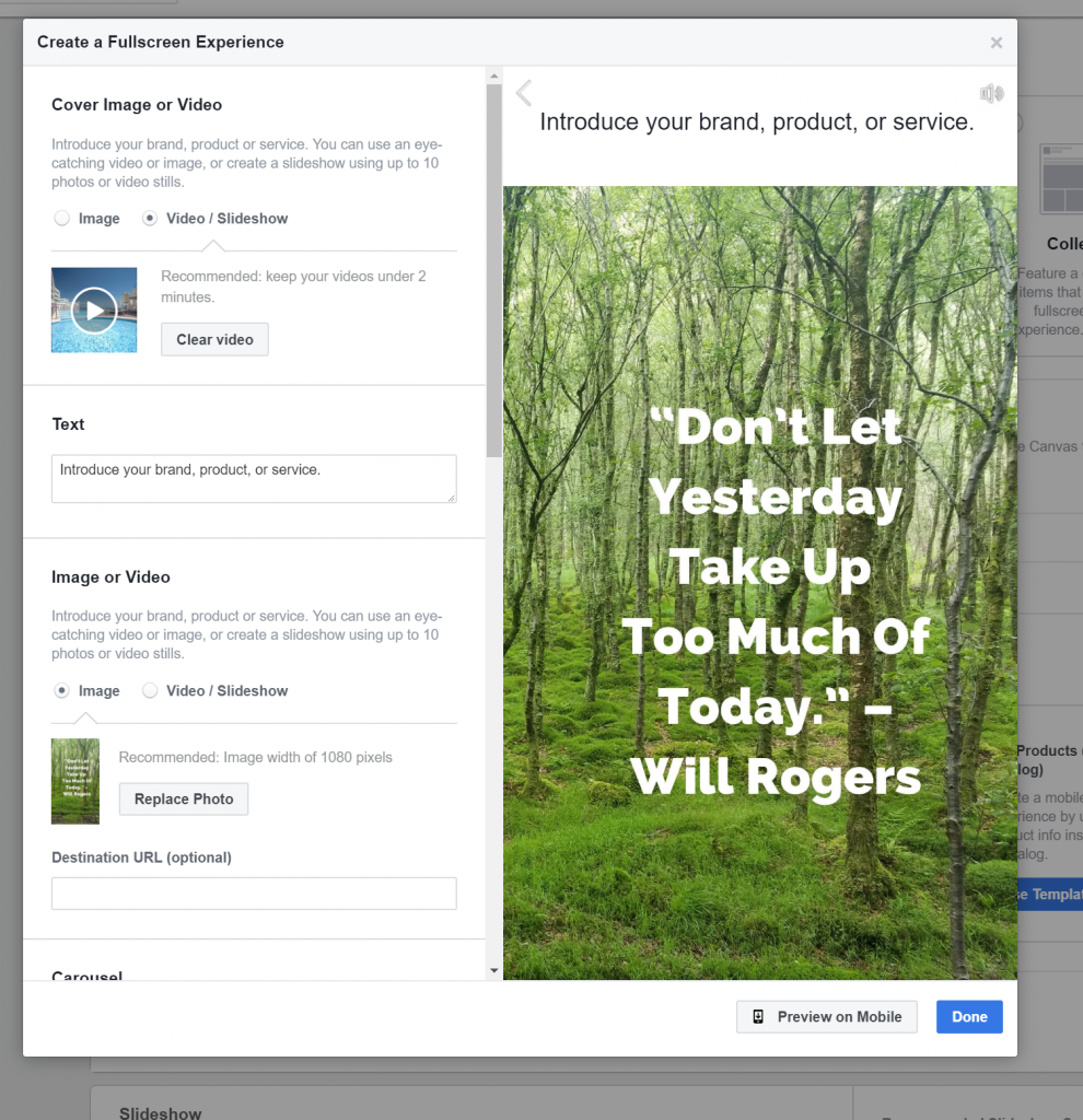
Canvas ads and Collection Ads are more advanced and can use images that are sized differently. You can have longer images and some of the Canvas and Collection options do need to be square.
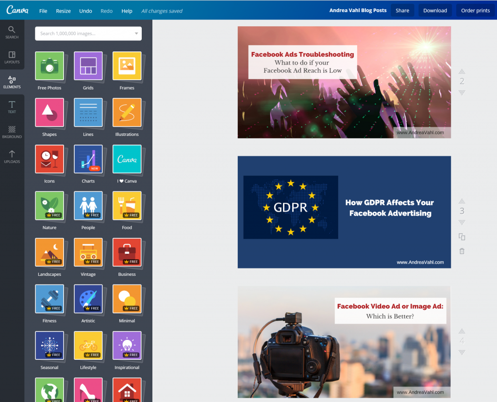
I use Canva to create the right sizes of images for Facebook Ads but there are other good tools out there like PicMonkey and RelayThat.
I use the Facebook ad dimensions for the featured image in my blog posts so that when I share it, it’s already set up to look good on Facebook and go into an ad.
Tip #2 – Not too much text
Even though the 20% text rule is “gone”, Facebook will still stop ads that have too much text in them.
You will get a warning that your ad may not run, but in general, I just see how it goes and place the ad anyway.
It is better to start with lower text images if you can.
You can use the Facebook Text Overlay tool to see what it says about the image before you place the ad.
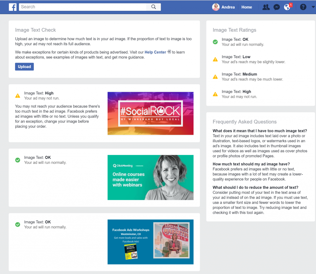
Text on book images or products or logos are not supposed to “count” in the text guidelines but sometimes your ad will get disapproved anyway. You can always appeal.
If you do have text, make sure the font is clear and the text is readable on desktop and mobile (if you are advertising on both).
Or you can use images with no text and just an eye-catching image.
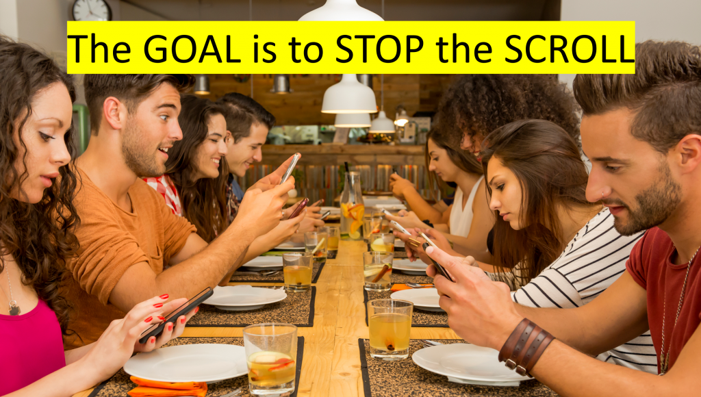
Tip #3 – Use an image that catches the eye
Whether you have some text in the ad, or no text, the base image you choose is critical.
In general, images with people in them do better than objects, but that isn’t always true.
Also, I try to avoid overly “cliché stock images”.
We are competing with friends and family posts so it can be hard to grab attention with your ad.
Think about what makes you stop and click on an ad. Is it the promise? Is it funny or unusual?
With Facebook Ads, the Goal is to Stop the Scroll
Some good places for images are:
- Pixabay
- Pexels
- Depositphotos (not free), but AppSumo usually has great deals!
Tip #4 – Test different images
Split testing your Facebook ads is the key to really finding out which image works best.
I often guess wrong. That’s why you must test at least 2 different images when you run an ad.
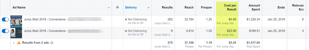
In this example, the top image got 5x cheaper conversions than the bottom ad – all targeting and the text were the same in each ad!
We didn’t run the bottom ad as long obviously because I didn’t want to waste my money (and I probably should have stopped it earlier actually).
Good images are one of the biggest factors in the success of a Facebook ad and testing what works for you can put you on the path to better results!