
Are you a speaker or presenter? Would you like to know how to improve your website to get more speaking gigs? I know that was something on my mind as I had my own website reviewed by the wonderful Karl Staib of the Domino Connection.
A while back (sorry Karl for taking so long to get this posted) Karl sat down with me and gave me feedback on how I can improve my speaker landing page.
Karl gave me the video replay of the call, and I took some notes about his great points below.
Here are my takeaways from our conversation and maybe they can help you as well when you are designing your Speaker Page:
#1 Open with a powerful headline
Having a powerful headline is a good idea for any page you want to engage people on. This is where you grab people. Any sales page, advertisement, or even blog post performs better with a good headline. Karl suggested a question that an event planner might have on their mind. Something like “Do you need your audience to really understand social media?” I tweaked it a bit and may even tweak it more as I do some more testing.
#2 Remove distractions
Again, another great tip for any sales page. You don’t want people getting distracted with extra things in a sidebar or clicking on a link that will take them away from your sales page. You want them to read your copy. Luckily, I have a theme that will easily allow me to remove the sidebars on any page on my website. If you don’t have that, you may want to consider a plugin like Premise to help you remove any distractions.
#3 Tell the story
Tell people what their life will be like after they hire you. What will people be saying about you as a speaker? How will hiring you to give a speech reflect on them? They want to make sure you are a grand slam so this is not a time to be shy. I’m always a little reluctant to toot my own horn but now is the time. Focus on the benefits you will deliver and the results of the speech.
#4 Give social proof
Testimonials are critical. Highlight them, accentuate them, and sprinkle them around like candy. I added break out boxes so the testimonials were more visible, and I added Twitter testimonials from webinars and talks I had done in the past.
#5 Make it readable
Don’t make the reader work to get through your sales page. Have things in order and condense your topics to make them easy to read and understand. Don’t switch back and forth between talking about yourself in the 3rd person and in the 1st person. Consider having your bio and headshot on another page because this page is designed to sell your services, not be a resource for those who have already booked you for an event.
#6 Have a good speaker’s video (aka speaker’s reel)
I updated mine to be more succinct and more professional. If you can have shots of the audience laughing and clapping that is ideal. Plan to have a videographer at a few of your speaking events to get good footage. Also make sure it’s not too long – three to five minutes is ideal.
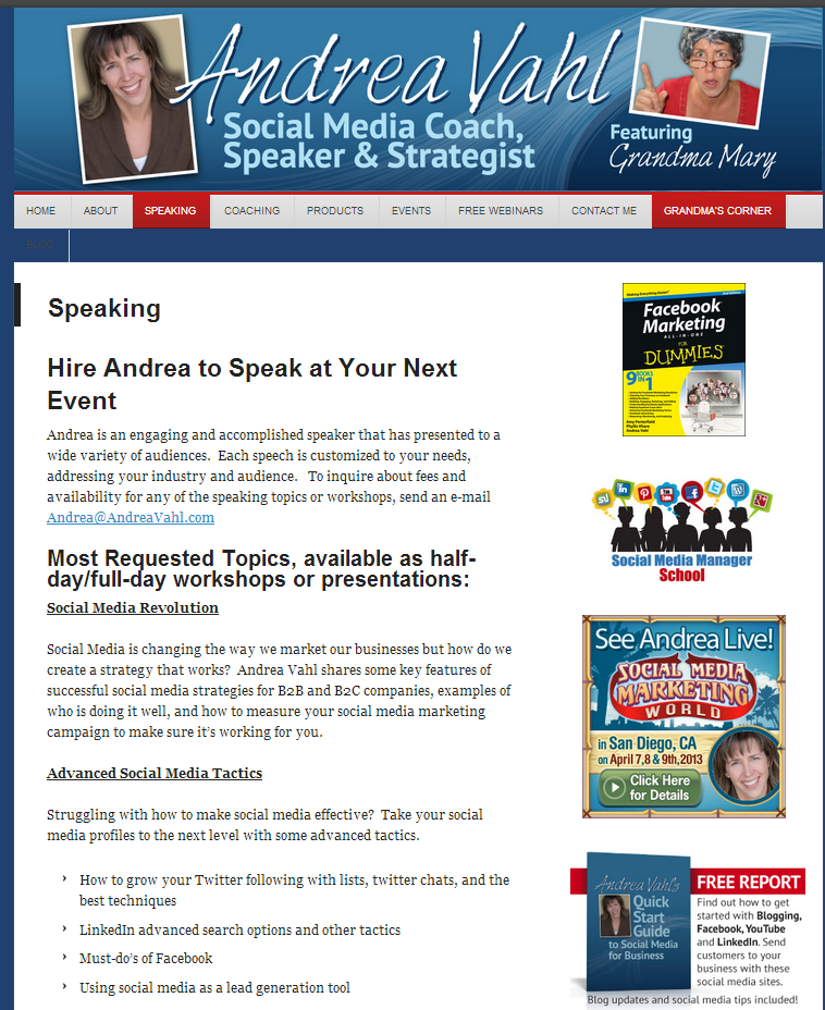
Here is my page before the changes:
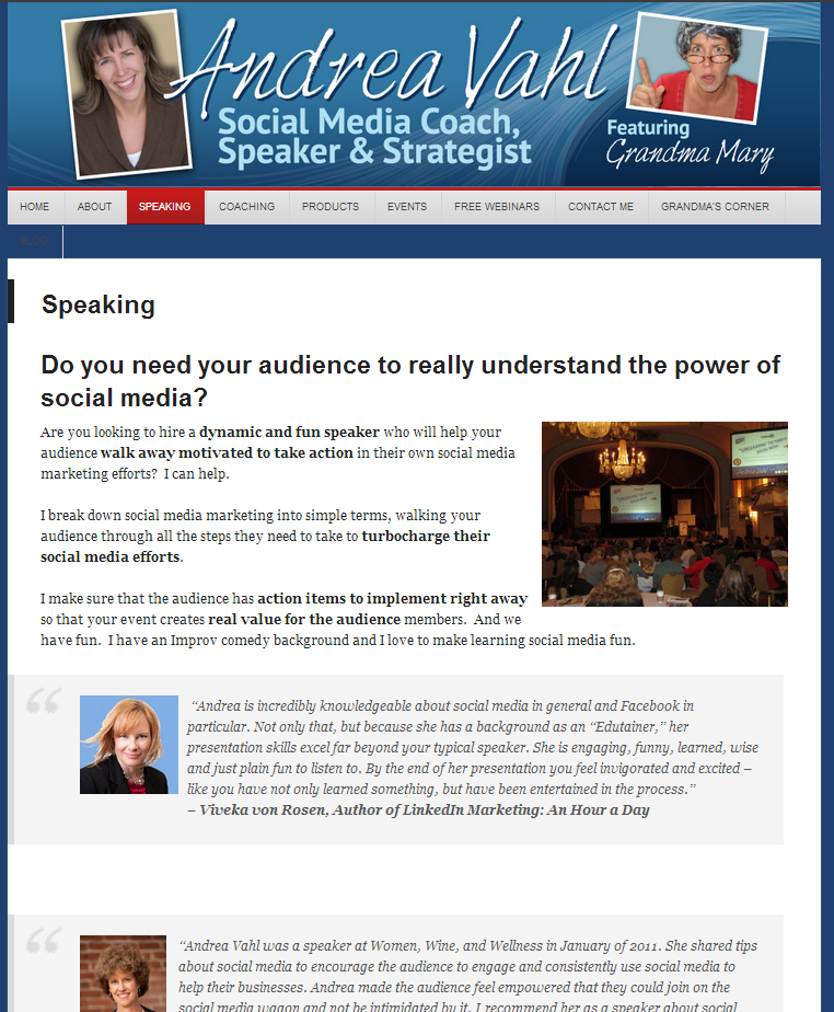
And here is my page after the changes:
Or you can see the whole thing for yourself at www.andreavahl.com/speaking
This is still a work in progress but I think there have been great improvements. Thanks so much to Karl Staib for the review! Make sure you read Karl’s post for more information on improving sales pages: How to Avoid the 3 Biggest Sales Page Mistakes.
What do you think? Better? Any other tips for me? What has this inspired you to change on your own site? Let me know in the comments!


Great job. I do like the new, aka after, one.
Thanks so much Jessica!