Facebook lifted the 20% maximum text Facebook Ads Text Rule and there was much rejoicing. But what does that really mean for marketers? Should your images be filled with text now?
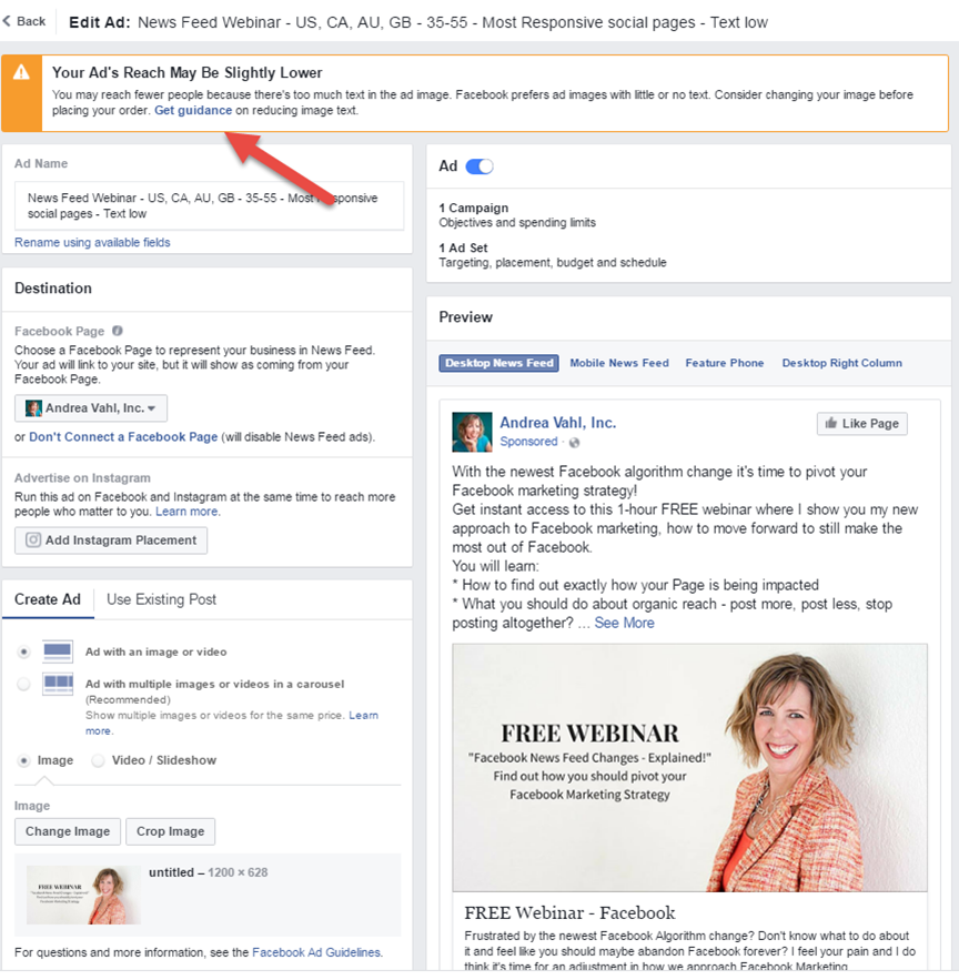
Facebook still gives you a warning that your ad may have “less reach” due to having too much text when you are creating an ad. But is that really true? I decided to do some experimenting to find out.
In this article you’ll find out what has changed with the new Facebook Text Rule for ads, how it may or may not affect ads, and what you should change in your strategy.
**UPDATE Since this published, Facebook does appear to be actually stopping ads that do have too much text.
What is New with Facebook’s Text Rule for Ads
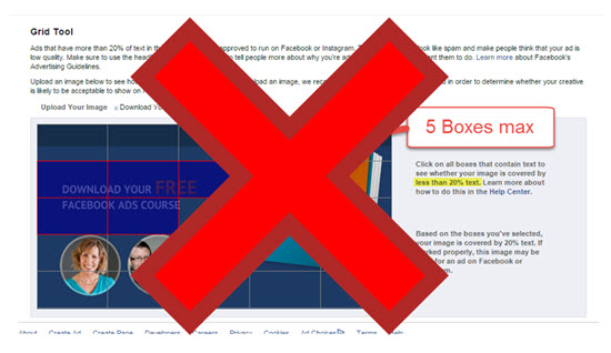
Previously Facebook would not let ads run if they had more than 20% text according to their Grid Tool.
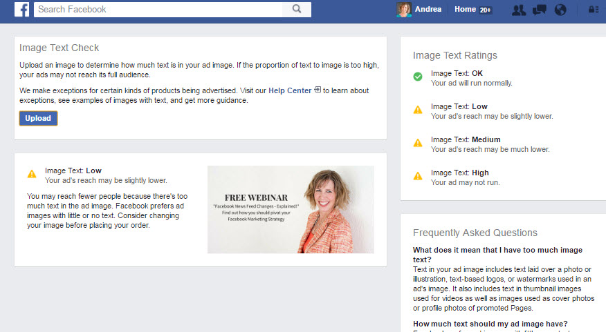
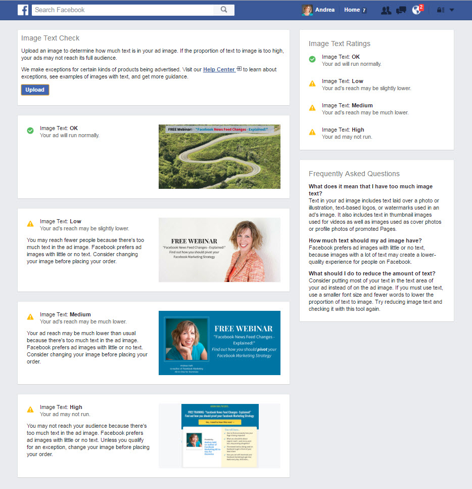
The Facebook Grid Tool is still available but it has changed. It now gives you an Image Text Rating
- Image Text: OK
Your ad will run normally. - Image Text: Low
Your ad’s reach may be slightly lower. - Image Text: Medium
Your ad’s reach may be much lower. - Image Text: High
Your ad may not run.
So I did some experiments to find out if a high text image truly would get less reach or no reach or cost more to reach people.
Case Study – Low, Medium, and High Text in Facebook Ads
I ran two short experiments with different images to see how the text affected the reach and cost of the ad.
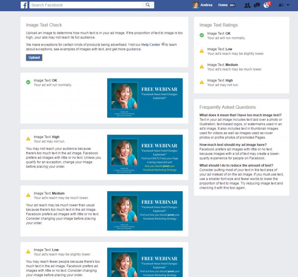
First I created different images with different levels of text.
I spent $50 on each ad and ran them for just a day so it was a quick experiment. I kept the text and targeting of the ads exactly the same so the only difference was in the images.
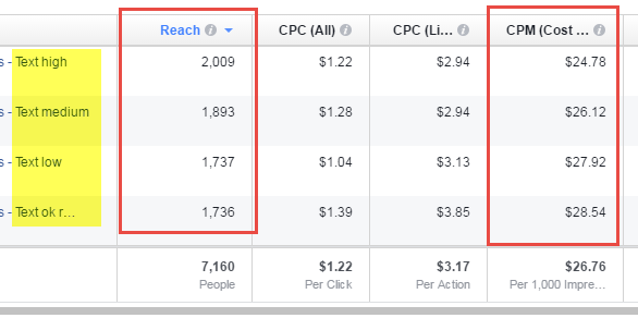
I watched the Reach of the ads as well as the CPM (cost to reach 1000 people) which would be affected if the ads did get lower reach. And I got very interesting results!
So the ad with the highest text got better reach and lower CPM!
In general, I don’t really care about reach. That’s not the true goal of this ad – it was to get optins to the Free Webinar on News Feed Changes (feel free to sign up for the replay if you are interested).
So I looked at how each ad did in terms of optins. In this case the ad with text OK (one step up from the low text) showed the best conversion rate but something was a little funky with these results since there were 18 conversions and 13 link clicks which doesn’t make sense.
Since this was a small test, I decided to do a second test with the images a little more “standardized” since each image had a different look and feel.
For my second test, I created images that all used a basic blue background and my image but varying levels of text.
I again ran the experiment for 1 day with the same text and target for the ads at $50/each.
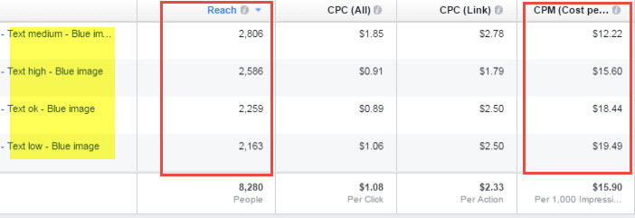
In this case the medium text and high text ads got the best reach and the best CPM.
But again, I don’t really care about reach. How did they convert? (I use the Facebook Pixel to measure conversions)
What I found was the high text image converted the best! Again, the results are slightly off because one ad is showing more conversions than link clicks but that sometimes happens with Facebook’s reporting.
And obviously these were smaller experiments so more testing is always needed. But I find this encouraging because Facebook isn’t completely restricting an image just because it might have higher text.
Facebook Ad Text Experiment Conclusions
In both this more formal text and in other ads I’m running for clients, I’m not seeing a decline in reach or higher expenses for any ads I’m running with higher text.
And it’s possible the the added text in certain situations may help someone get the information they need to encourage them to opt in or purchase your product. I’m also running ads with images that have no text at all and those are doing well in certain situations, too.
With any ad, the responsiveness and effectiveness of different tactics sometimes depend on the niche and the audience. That’s why you must do your OWN experiments and testing to find out what works best for you.
So many variables go into the conversion to a lead – landing page, images, message, targeting – so make sure you know what works best for you.
Facebook Advertising Secrets Course
If you want to go farther with Facebook Ads, be sure to check out my full Facebook Advertising Secrets course which is amazing – 4 modules covering Facebook and Instagram advertising and a private Facebook Group to ask questions! But the biggest benefit you get with the course is access to the Facebook Group where you can get all your Facebook Ad questions answered. We give feedback on ads, troubleshoot reports, and give advice on how to make your Facebook ads shine!

If you really want to grow your business quickly, Facebook Ads is the best vehicle to do that on the internet right now. Join me at www.fbadvertisingsecrets.com
Have you done any experimenting with text in your Facebook Ads? Share your thoughts with me below!










Andrea: I love that you tested this! And did it twice as well. Were you surprised with the results? I am! So what I’m getting out of this is that we shouldn’t be afraid of too much text as long as it is informing our audience and is tastefully done. Well done you!
I am finding it to be exactly the same. However, some of my clients still can’t boost posts or run ads with more text. I am still getting the old message.
Very interesting. And not surprising. FB knows more text helps conversions. And that means less ad spend, which is not good for FB.
Great stuff Andrea! Thanks for sharing! I will test it with some of the affiliate links I promote.
Great article, Andrea! Thanks for sharing your results.
Thanks Debbie!
So glad you enjoyed it 🙂
They just like to scare us with their “lower reach” threat 🙂
I’ve heard of that and haven’t experienced it yet myself so I haven’t been able to test this option but you may try going into the Ads Manager and promoting the post from there rather than from the Timeline with the Boost post button. Not sure if you’ve already tried that approach but it’s worth a shot!
I was surprised! That’s why I had to share! Yes that is exactly the message I took from this too. I don’t think a “flyer” would do well but as long as the text adds to the message and helps the conversion then I think it will do better!
Exactly! Pretty sneaky, but I given them points for creativity. 🙂
This confirms my own very limited experience. Im a volunteer for a small fiber festival and we simply wanted to increase exposure to our event. There were no expectations for conversions, we just wanted to have eyes on our event info. I designed an image with text details overlaid on a photo collage and then tried to boost it. At first we were refused because of too much text, but I tried again and FB finally took the image. The post did very well in both reach and engagement. A week later I tried again and FB simply refused the boost. So I could create our further ads with images only and try to include text details in the description. These were boosted, but didnt perform nearly as well. Curious to me.
What a fabulous series of experiments Andrea. it made very good reading to have these results put in front of us. Not every body has $400 to play with for such an exercise, so I am very grateful to you for doing this.
Thank you Andrea!!! Excellent case study and very enlightening! I knew that if you could get more text in an ad people may be more likely to click and convert because they know what they are clicking on before they start. So many of us don’t read the text above the pic before making a decision to click. Awesome results! Thanks!
that is very interesting Andrea, thanks for taking the time to share this with us!
That’s hilarious! I’m also finding the grid tool innacurate.
The audience may matter. I’m promoting my latest dimensions infographic right now. In one case, I’m using the thumbnail that I use in the organic post — it has a ton of text. In the other two cases, I’m using an image that would previously pass the 20% rule — one orange and one dark brown.
In this case, my goal was traffic since I was promoting the infographic. I created one ad set targeting my website visitors during the past 180 days and another ad set targeting lookalike overlap (whole different story on how that was done!). Both ad sets have a $50 daily budget.
When targeting my website visitors, here are current results…
High Text: $1.07 CPM, $.05 cost per link click
Orange: $0.19 CPM, $.02 cost per link click
Brown: $0.14 CPM, $.01 cost per link click
So in this case, it costs five or six times more to reach people with the high text thumbnail. The overall engagement rate is as good or better, but it still ends up being 4-5 times more expensive per link click. An important note, though, is that Facebook has run the high text ad much more than the other two. I have recently stopped the high text ad, so we’ll see what happens.
In the case of targeting lookalike overlap, I’m seeing very little difference in CPM.
High Text: $4.61 CPM, $.20 cost per link click
Orange: $4.24 CPM, $.34 cost per link click
Brown: $4.62 CPM, $.35 cost per link click
Again, the high text image gets slightly better engagement, so that’s resulting in a better cost per website click.
It’s a small sample size, of course. It’s never going to be the same for every case. But interesting.
Thanks for doing this experiment, Andrea! Guess we can’t take what FB says as gospel truth 😉
Great post to help weed through the confusion. I am a firm believer in just the right image and just the right text; regardless of a specific length. What works is what works, and not what Facebook pushes as policy!
Excellent post. Great resource. Thank you for sharing……………….
http://www.rationaltechnologies.com/